.png)

.png)


Rebekah Daniels
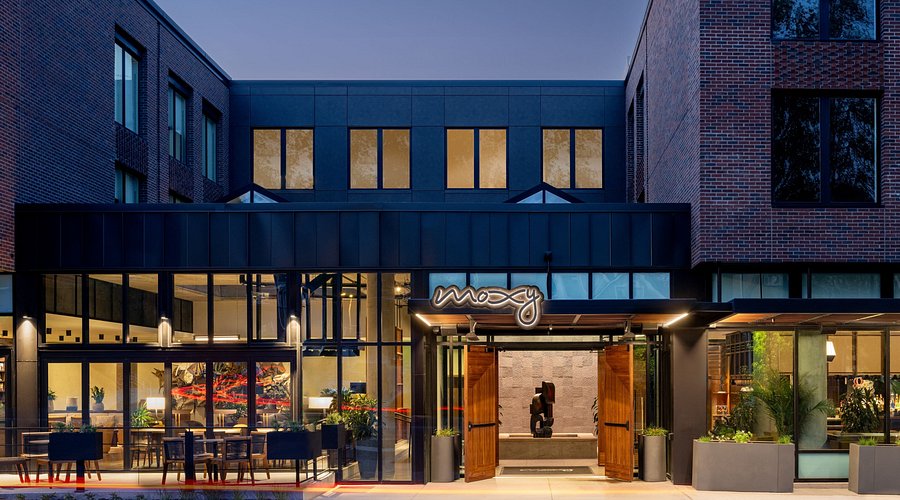
Moxy Hotel, a Guest Arrival Audit
This audit focused on the arrival experience and guest flow at the Moxy Hotel in Boulder. While Moxy aims for a casual, playful atmosphere, the first impressions tell a different story. From difficulty finding the entrance to a stark lobby with unclear circulation, the guest journey begins with friction. The absence of consistent hospitality cues — from staff presence to sensory design — leaves visitors uncertain about how to navigate the space or settle in.
Arrival
Despite prominent signage on Broadway, the entrance is difficult to locate. Turning at the sign leads to a dead end, and there is no directional signage to guide guests to the actual entry. Only after circling the block did I find the entrance. A simple corner sign — “Looking for Moxy? This way” — would solve this.
The lack of door staff was also notable. Two valet staff were outside, but guests opened the heavy doors themselves. I personally had to wait for a stream of guests to exit before I could enter. This created unnecessary friction at the very first touchpoint.
Ambiance & Layout
The entry space is a square concrete and stone lobby with a central trough feature. The sharp edges, blank acoustic wall, and lack of welcoming signage created a harsh and confusing impression. Guests clustered uncomfortably around the trough with bags brushing against it.
The check-in desk is on the right, but shares sightlines with what appears to be a bar or coffee area, making the intended flow unclear. To the left, stepped seating leads to restrooms. Elevators are hidden behind a partition with no directional cues.
On the positive side, the space incorporates indoor/outdoor elements (skylight, foldable glass windows), board games, and local flyers. The ambiance is more casual and bohemian than Limelight, though missing strong visual anchors or a cohesive color identity.
Navigation & Clearances
Clearances are consistently narrow, creating bottlenecks. I observed multiple instances of guests needing to move aside to let others pass. One older couple asked aloud: “Where do people spend time and sit together?” and left unimpressed.
Poor wayfinding compounds the problem: no clear signage to indicate check-in, elevators, or restaurant/bar.
Restrooms
The restrooms were the weakest element:
- Cheap metal stalls with faulty locks (first door I tried didn’t close).
- Cleanliness issues: unflushed toilet, urine odor, ineffective air freshener.
- Fixtures malfunctioning: one soap dispenser inoperable, another dispensing onto a guest’s laptop when set on the sink edge.
- Poor layout: paper towel dispenser not aligned with receptacle; trash can positioned separately.
Scent & Sensory Elements
Unlike Limelight, Moxy had no scent branding in the main areas. The lack of olfactory cues made the environment feel flat.
- Wayfinding: Add clear signage for check-in, elevators, restrooms, and F&B. Improve entry signage at Broadway corner.
- Welcome Experience: Soften the concrete-heavy entrance with plants, art, or a design element on the blank wall to create warmth.
- Restroom Improvements: Upgrade locks, move soap dispensers to the sink itself, and align paper towels with trash receptacles. Increase cleaning frequency.
- Hospitality Staffing: Position door staff or greeters during peak flow times to assist with heavy doors and welcome guests.
Moxy’s casual, playful intent is undermined by poor flow, inadequate signage, and substandard restrooms. While structural issues like narrow clearances are permanent, relatively small investments in signage, fixtures, and service could significantly improve the guest experience.