.png)

.png)


Rebekah Daniels
Sézane, a Luxury Fashion UX Audit
As a self-proclaimed Francophile, I’ve been eyeing Sézane’s website for months. The “delicate-flower-meets-modern-minimalism” styling and French–inspired photography left me drooling — until I tried using the site. Within ten minutes I grew frustrated, and Reddit confirmed I wasn’t alone.
Luxury doesn’t stop at brand aesthetic. It lives in an experience so seamless you don’t even notice it happening. That’s where Sézane stumbles.
What’s Working Beautifully
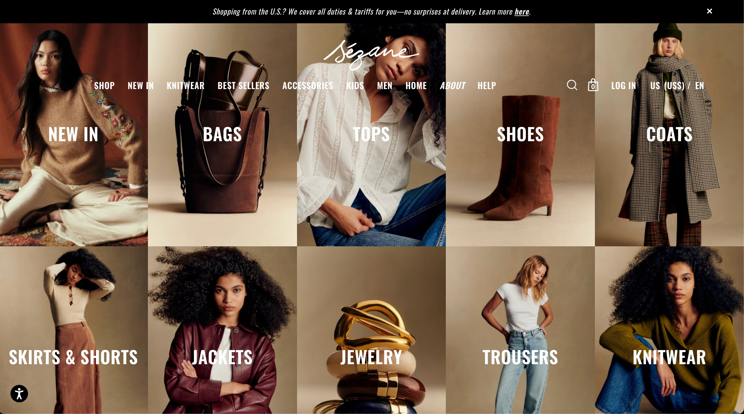
- Photography & Brand Aesthetic
Sézane nails editorial energy. Every product image feels like it was shot on the Côte d'Azur at golden hour. Creamy linens, warm lighting, and jewel-toned accents create an immersive lifestyle that feels aspirational yet accessible. Navigation is smooth, categories are clear, and browsing pulls you into a future-self vision more than just a product grid. - Packaging with a Flirty Upsell
Opening a Sézane box is a tactile reveal: checkered tissue paper, a subtle signature fragrance, and even brochures misted with L’eau Sézane eau de toilette. It’s sensual, clever, and an intentional upsell. My suggestion: include a mini sample of L’eau Sézane with a QR code CTA for easy purchase. - FOMO + Lifestyle Framing
The Archives and Last Chance sections drive urgency and exclusivity, turning past-season leftovers into limited treasures. This is a smart emotional play, aligning well with Sézane’s aspirational brand.
Strategic Frictions
- No Product Reviews
No reviews = no trust. With highly variable sizing and small-batch releases, users are left guessing. My experience (and multiple Reddit threads) confirmed: one item fits, the next is three sizes off.
Platforms like Lulus encourage reviews with body measurements and photos, building trust. Sézane should allow users to filter reviews by body type or expand sizing with petite/curvy fits to broaden beyond the slim-French-girl archetype.
- The Self-Emptying Cart
Sézane empties carts after 30 minutes, wiping out hours of careful browsing. This UX sabotage punishes common shopper behavior: building a cart, reflecting, returning later. I rebuilt mine four times before buying — and returned half due to fit issues that reviews could have prevented.
Recommendations:
- Autosave carts into a new list with a playful name (“Shoulda put a ring on it”).
- When carts expire, offer a Favorites CTA to re-add items.
- Allow users to save carts manually as lists.
- Mini UX Notes (w/ Ryan, age 10)
Even my son noticed:- No hover effects on homepage categories.
- Nav bar disappears on the Journal page (white-on-white).
- Filter accordions collapsed by default — open them instead.
- Animations inconsistent between open/close states.
Bold UX Idea
What if Sézane built a Personalized Fit Engine? A quick “Getting to Know You” quiz could collect measurements and preferences, then recommend items likely to fit. Combined with customer reviews, returns data, and LLM-powered learning, this would create smarter segmentation and a brand experience that feels intuitive, not risky.
1. Enable Product Reviews
Allow customers to leave reviews with body type, measurements, and fit notes. This isn’t a threat to Sézane’s brand image — it’s a trust builder. Filtering reviews by body type or real-world size metrics would reduce returns and let shoppers self-select instead of guessing.
2. Fix Cart Logic
Stop carts from auto-emptying after 30 minutes. Options include:
- Autosave carts into a new list with a playful name (e.g., “Shoulda put a ring on it”) so users can return later.
- When a cart is cleared, display a native CTA: “We remembered your items — want to save them to Favorites?”
- Add a manual save-to-list feature, giving shoppers control.
These small changes would eliminate frustration and prevent lost sales from customers who aren’t ready to commit on the spot.
3. Polish Micro-UX
Implement the small fixes even a 10-year-old spotted:
- Add hover states on homepage image categories to orient users.
- Ensure the nav bar is visible on all pages, including Journal.
- Default filter accordions to open (users who click “filter” want to see options).
- Smooth out animation consistency when expanding/collapsing filter drawers.
4. Leverage Packaging
Build on Sézane’s gorgeous unboxing experience by including a mini sample of L’eau Sézane with a QR code on premium cardstock for easy purchase. This adds a low-cost upsell path that feels like a gift, not a pitch.
Sézane’s aesthetic is aspirational, but the digital experience undermines trust. Small UX fixes — reviews, cart memory, polish — would turn the frustration into delight, letting the brand’s luxury storytelling truly shine.